THE PROJECT
Geometric character.
Everyday presence.
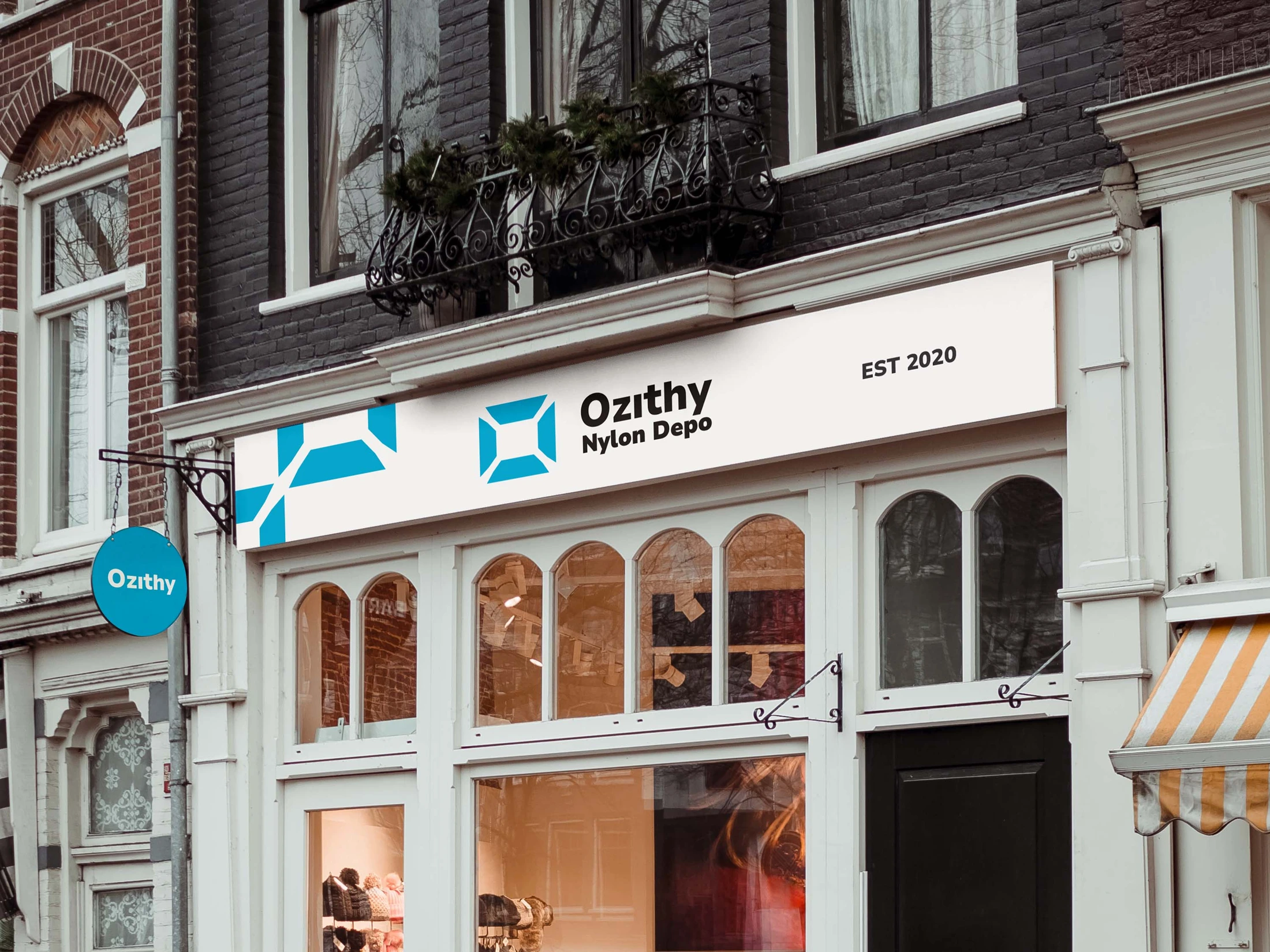
A geometric visual identity for Ozithy Nylon Depot, seen through its mark and storefront application.
- CLIENT
- Ozithy Nylon Depot
- DISCIPLINE
- BRAND IDENTITY
- STUDIO
- XAI Studios
01 / The brief
A clearer identity for a retail experience.
Ozithy Nylon Depot needed a visual language that could feel distinct across its retail communications and digital storefront. The direction connects a recognisable mark, a consistent colour system and practical layouts for products and promotions. This case study presents the identity and website design, not a measured sales outcome.
02 / Identity
Build recognition from a simple idea.
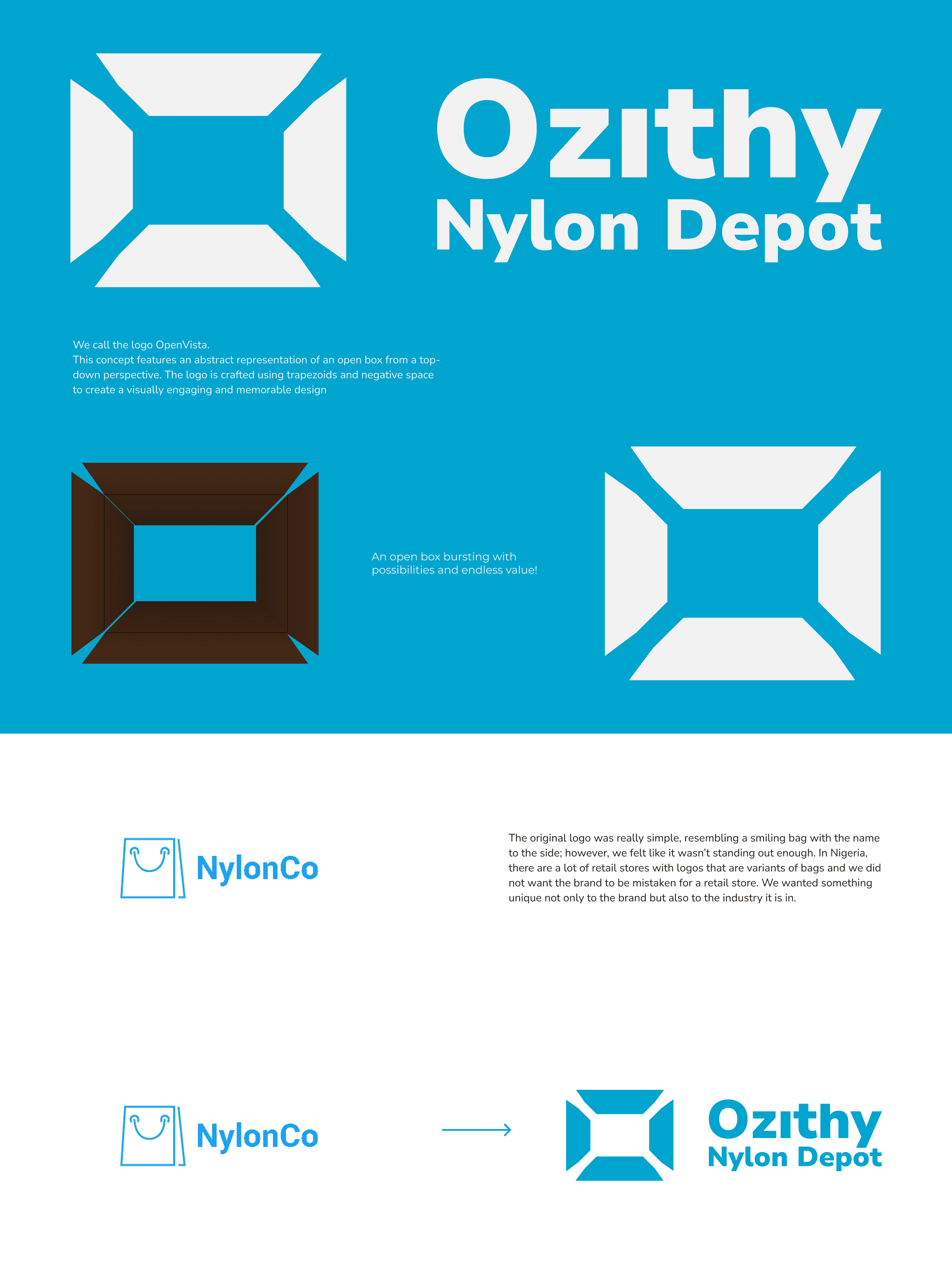
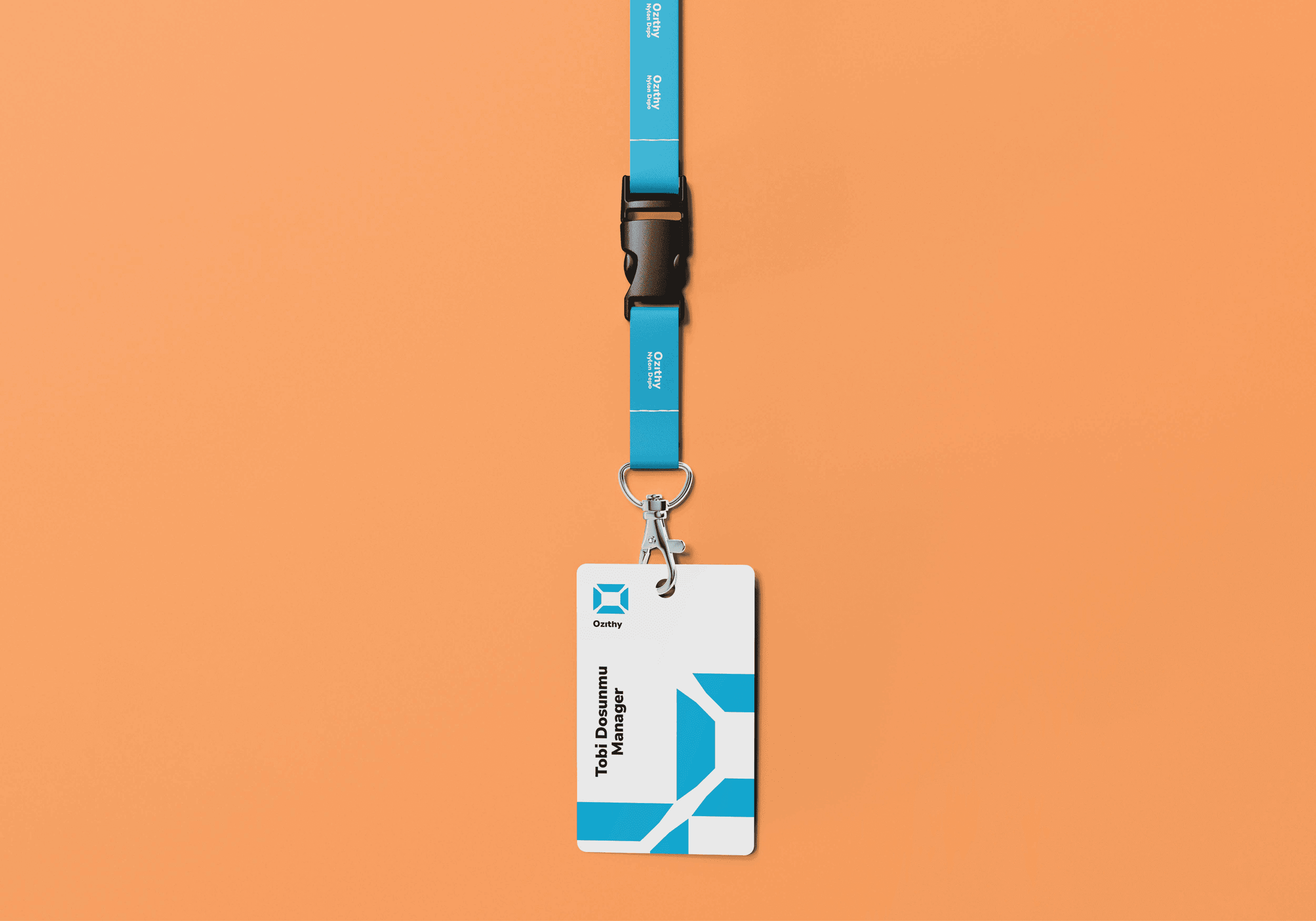
The identity development explores an open-box form: a straightforward symbol suited to a business built around everyday goods. The mark is supported by a blue-led palette and a visual system that can move between compact signatures and larger branded surfaces. The process presentation shows how the direction was refined; the application mockup shows how it can live beyond a flat logo file.
03 / Digital experience
Make the product the focus.
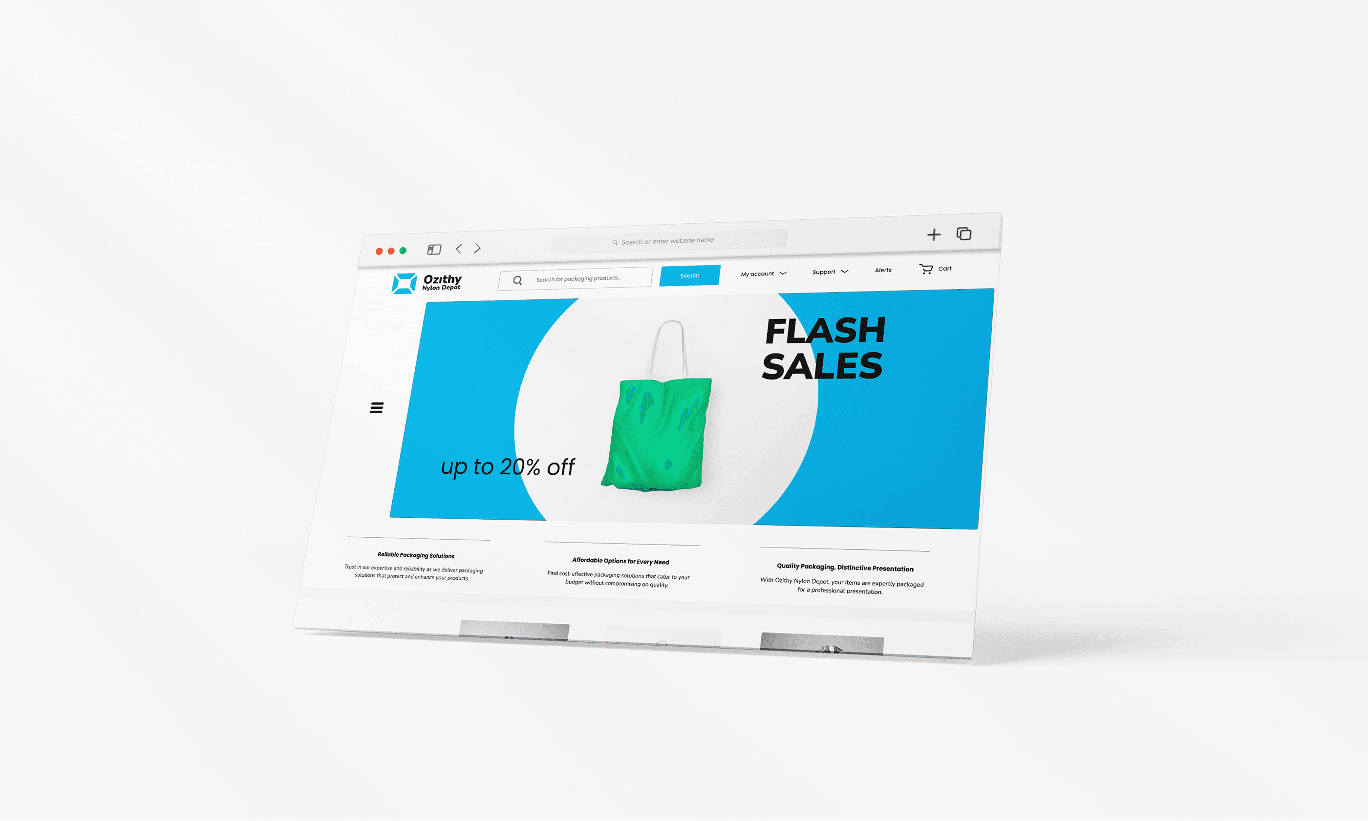
The website direction brings the identity into a shopping environment. Clear product hierarchy, room for imagery and recognisable promotional moments make the brand useful as well as expressive. The screen shown here is a design presentation mockup of that direction, not evidence of a live store or commercial result.

A CLOSER LOOK
From mark to place.
The storefront artwork shows the identity in a physical setting. The geometric symbol and name work together to establish a recognisable presence.
A detail from the storefront application. Gallery details are crops of the selected archive artwork.
Baron Architecture