
THE PROJECT
Building tomorrow’s Oyo.
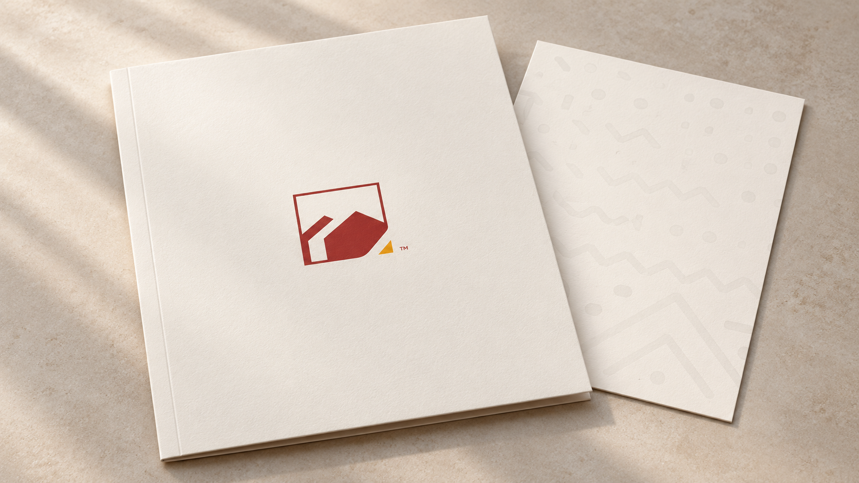
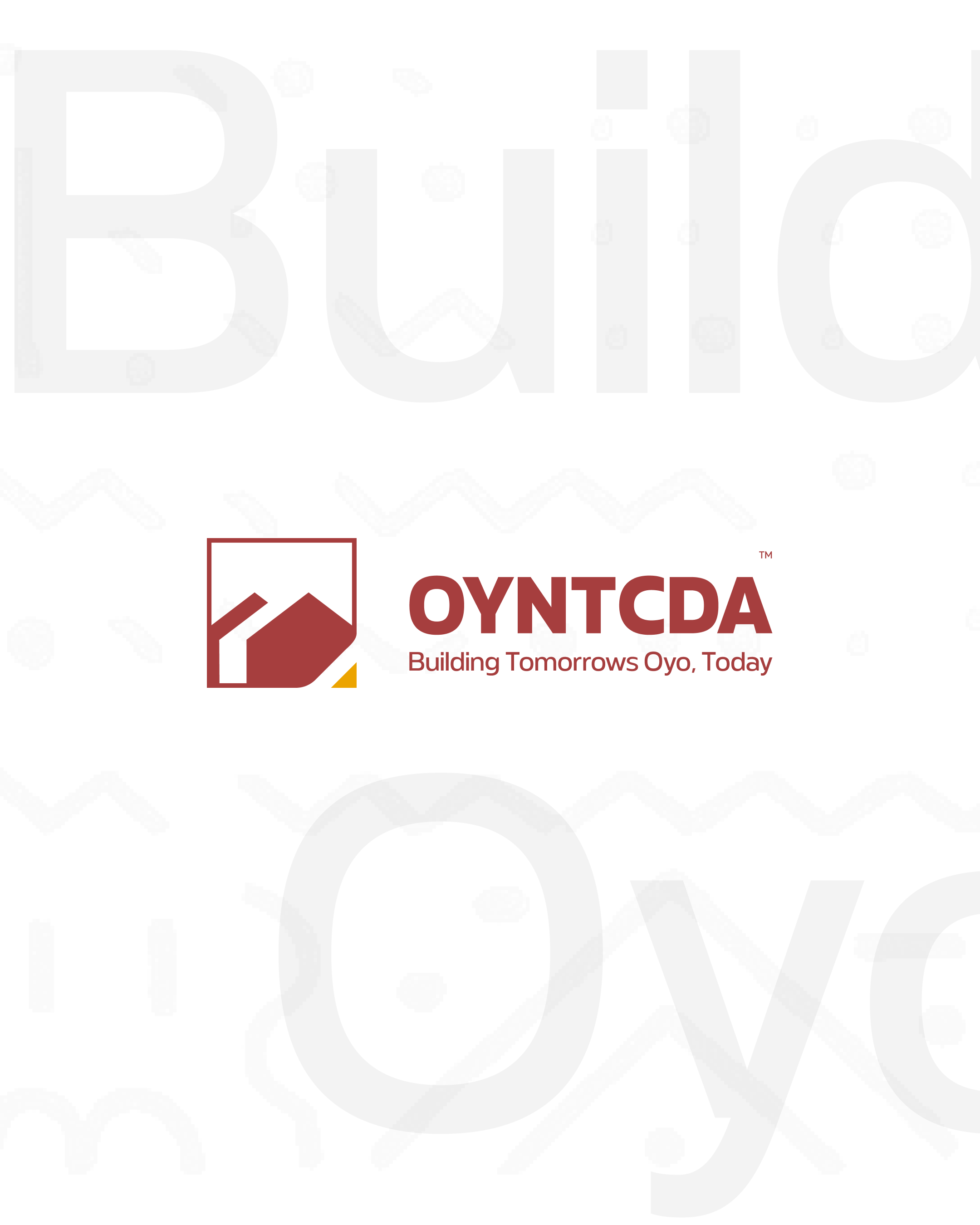
The visual identity brings the authority’s full name and OYNTCDA abbreviation into a recognisable institutional system. The supplied artwork combines an architectural symbol with a formal wordmark and the line “Building Tomorrows Oyo, Today”.
- CLIENT
- Oyo State New Towns and Cities Development Authority
- DISCIPLINE
- Brand identity
- STUDIO
- XAI Studios
01 / The brief
A public purpose. A recognisable identity.
The Oyo State New Towns and Cities Development Authority needed an identity that could communicate its focus on development while working across everyday institutional communications. The design brings together a formal name, an architectural symbol and the promise “Building Tomorrows Oyo, Today.”
The challenge is one of scale: the same organisation has to be recognisable on a small business card, in a social post and across the side of a vehicle. A consistent relationship between the mark, wordmark and tagline gives those different formats a common starting point.
02 / Identity system
One mark. A broader visual language.
The symbol uses a framed, architectural form with an angled roof-like gesture. Brick red gives the wordmark and primary mark a strong presence, while a small yellow accent introduces contrast without competing with the name.
The identity extends beyond the logo through a pale geometric pattern. Used at a lower contrast, it adds character to a page or background while keeping headlines, contact details and the core identity readable. The lockup and pattern provide two different levels of recognition: an immediate signature and a quieter supporting texture.
03 / Print applications
Authority in the everyday details.
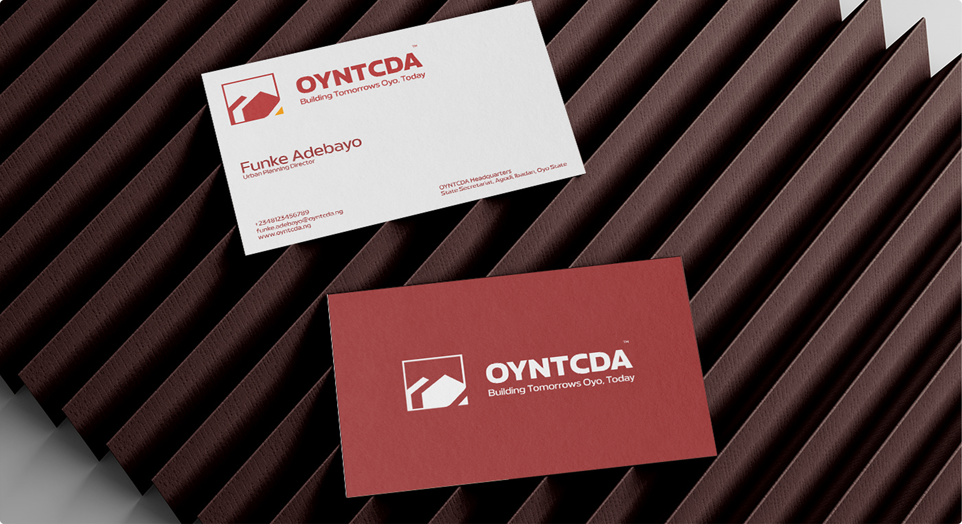
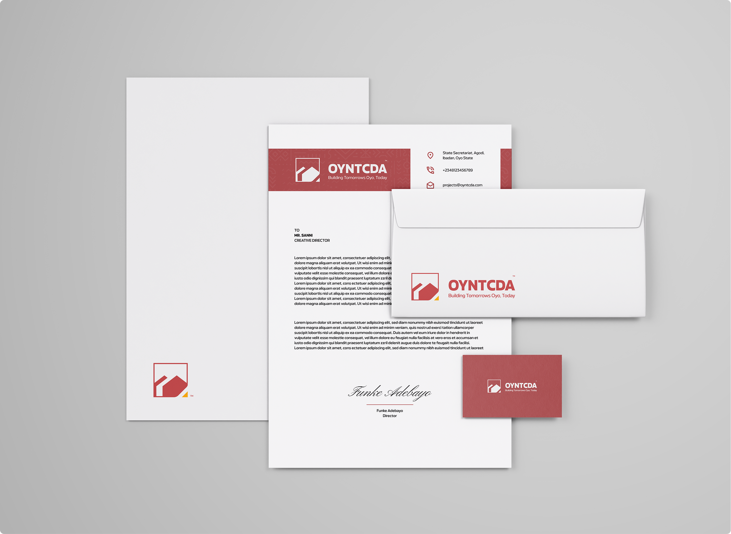
The stationery applications show how the visual system behaves in more formal settings. Letterhead uses a branded header with space for correspondence; envelopes and cards reduce that system to a simpler signature.
Red and white versions allow the same identity to work with different levels of emphasis. The business-card presentation brings that contrast into focus, while the stationery set shows how pattern, logo and information can coexist without every element demanding equal attention. These are presentation mockups, including sample correspondence and contact information.
04 / Across touchpoints
From the street to the screen.
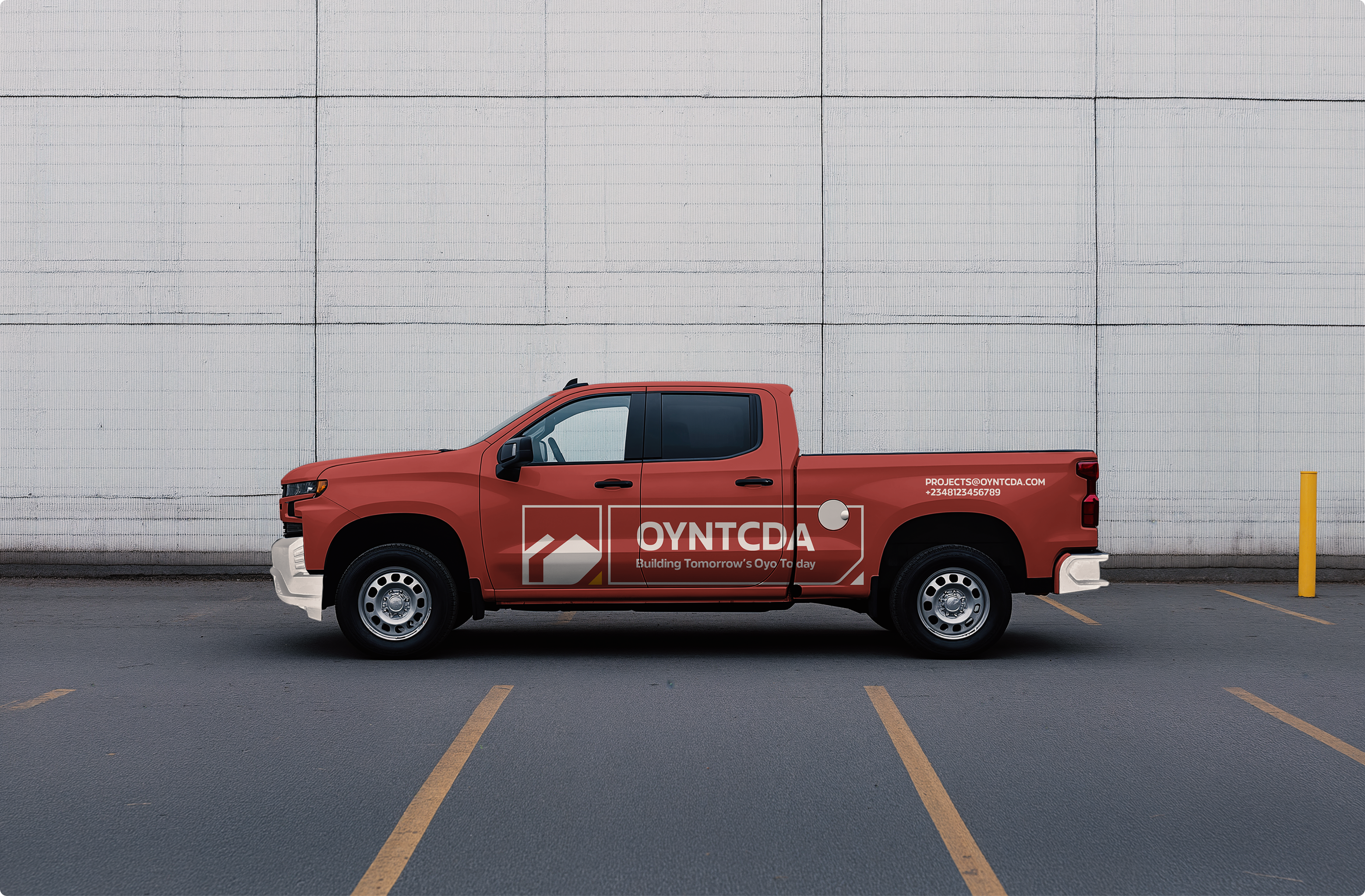
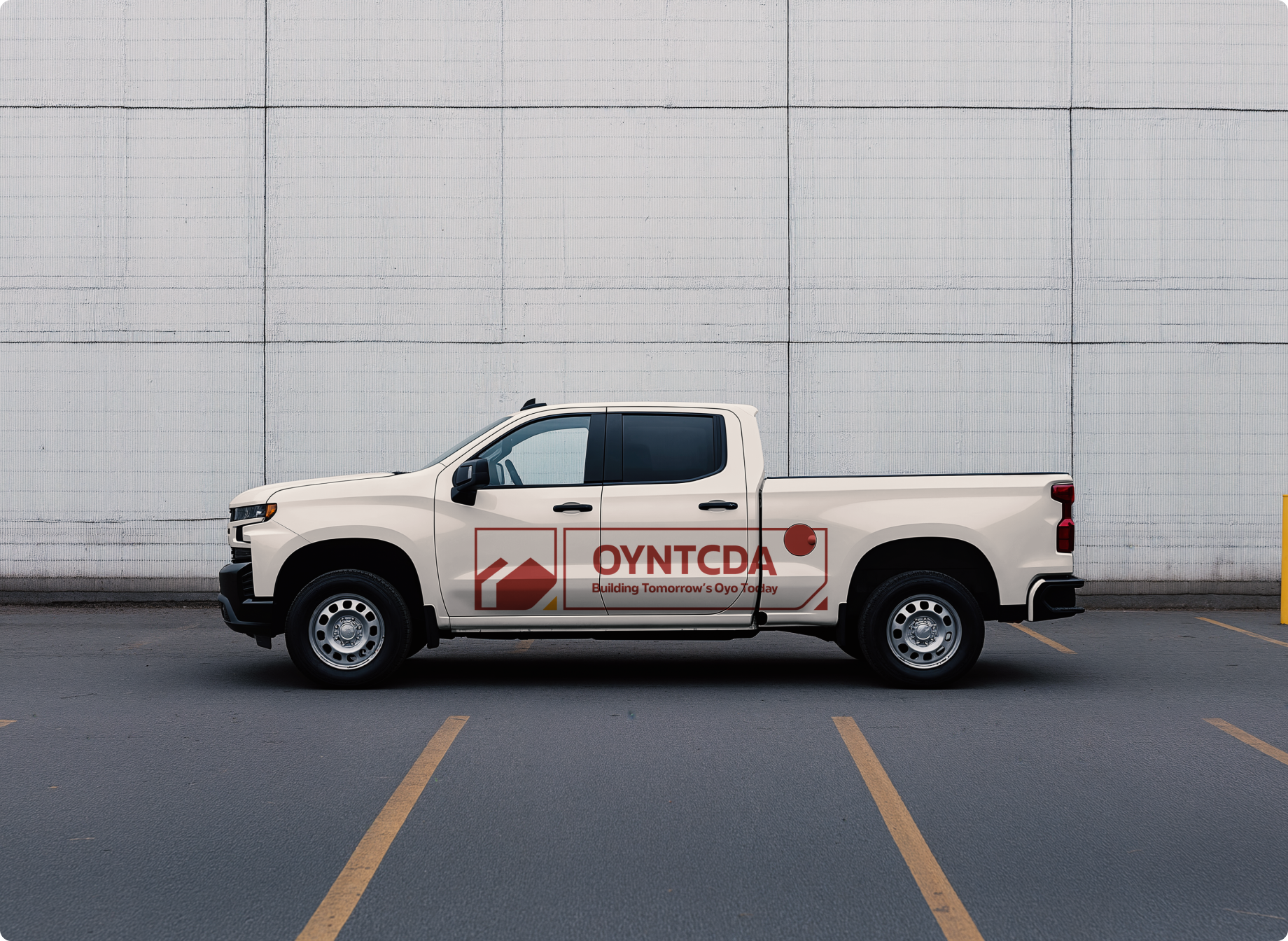
The vehicle mockups test recognition at a much larger scale. On the red truck, the white lockup stands apart from the body colour; the cream version reverses the balance with a red identity. Both keep the name and symbol together as a clear lateral signature.
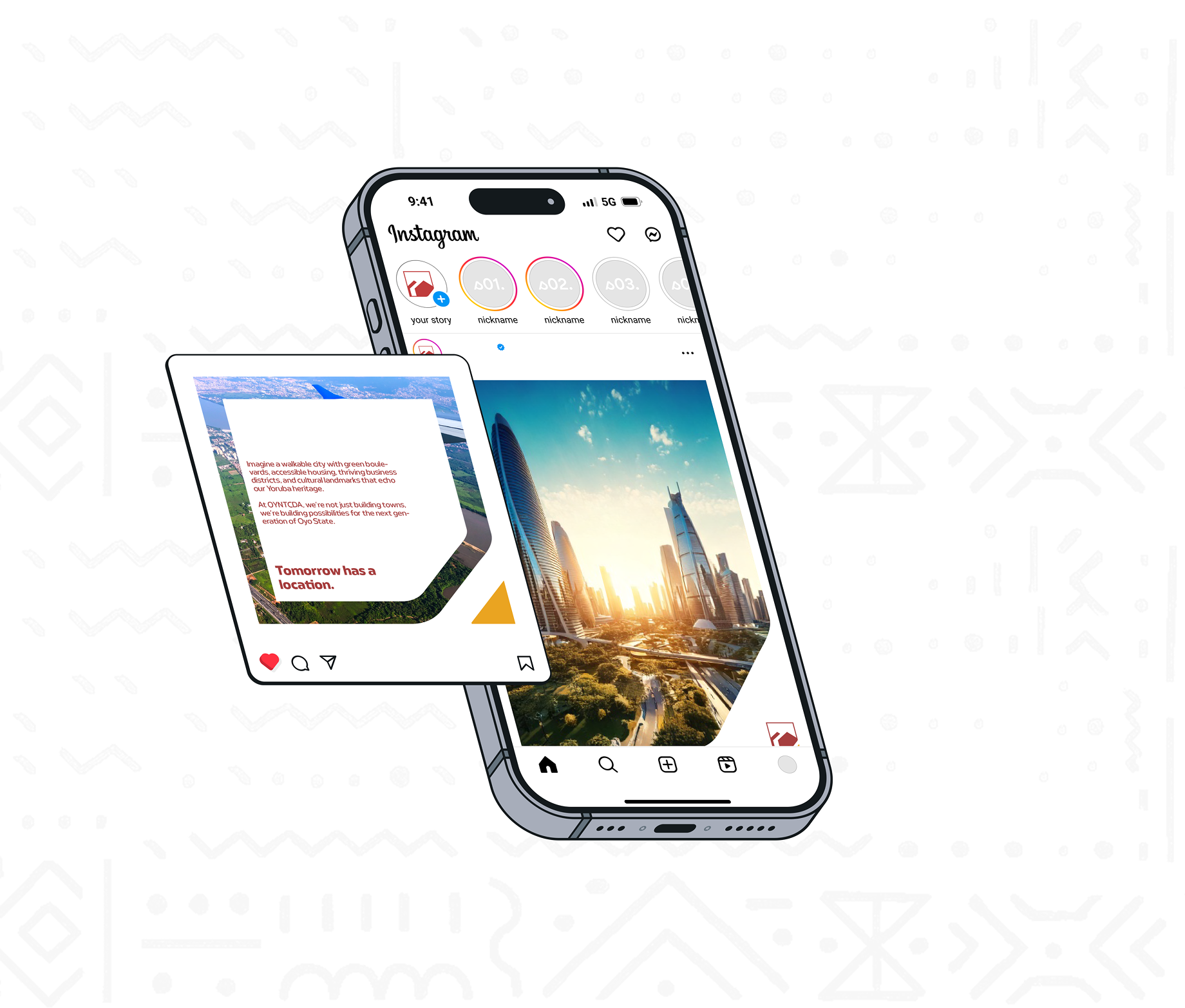
For social communication, the same red, yellow and geometric vocabulary frames more image-led storytelling. “Tomorrow has a location” gives the digital examples a concise message, with the identity acting as a consistent sign-off. Together, these applications demonstrate the range of the proposed system; they are not evidence of a completed physical rollout.

23rd Thrift Ville