THE PROJECT
A world around an existing mark.
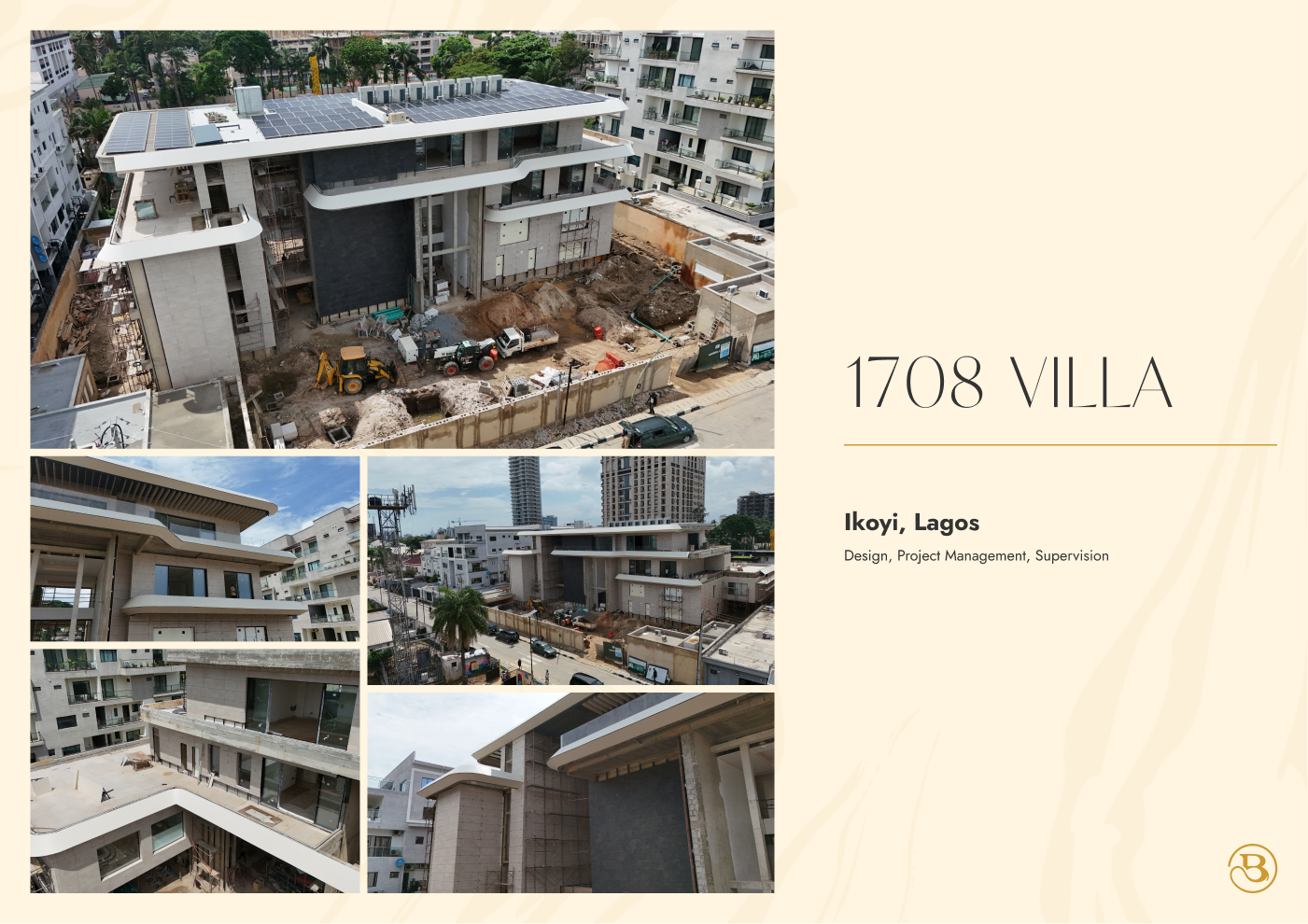
XAI developed Baron Architecture’s visual identity around its existing logo and designed its website. The assignment focused on the wider identity and digital experience, not the creation of a new logo. The company-profile design carries that identity into an editorial presentation of the practice’s architectural work, pairing project photography with a restrained cream-and-gold layout.
- CLIENT
- Baron Architecture
- DISCIPLINE
- Visual identity, website & editorial design
- STUDIO
- XAI Studios
01 / The brief
A consistent presence for an architectural practice.
Baron’s existing logo provided the starting point. XAI’s work explored the wider visual identity and website, then carried that language into the company-profile presentation. The task was to make those touchpoints feel related while allowing the architectural projects to remain the focus.
This is an identity-extension and communication story, not a claim that XAI designed Baron’s original logo or the buildings shown in its portfolio. The value is in the relationship between typography, layout, imagery and the way the practice introduces its work.
02 / Editorial design
Give the architecture room to speak.
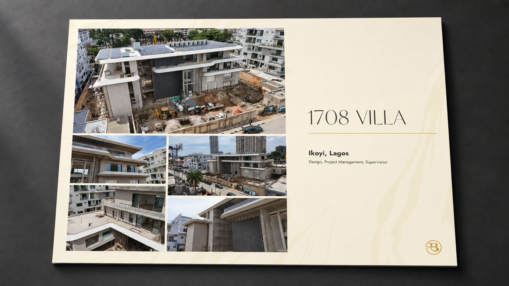
The company-profile spread uses a light background, a restrained gold accent and a clear hierarchy between the project name, descriptive copy and photographs. That hierarchy lets a reader move from the broad impression of a building to the details of the individual project.
The 1708 Villa layout demonstrates this approach: the photographs carry the story, while the surrounding typography and colour hold the page together. The system is deliberately quieter than the architecture it presents.
03 / Across touchpoints
One language, in print and on screen.
The wider direction connects the website’s editorial presentation with the company profile. Cream and gold tones, controlled typography and space around the imagery establish continuity without forcing every format into the same composition.
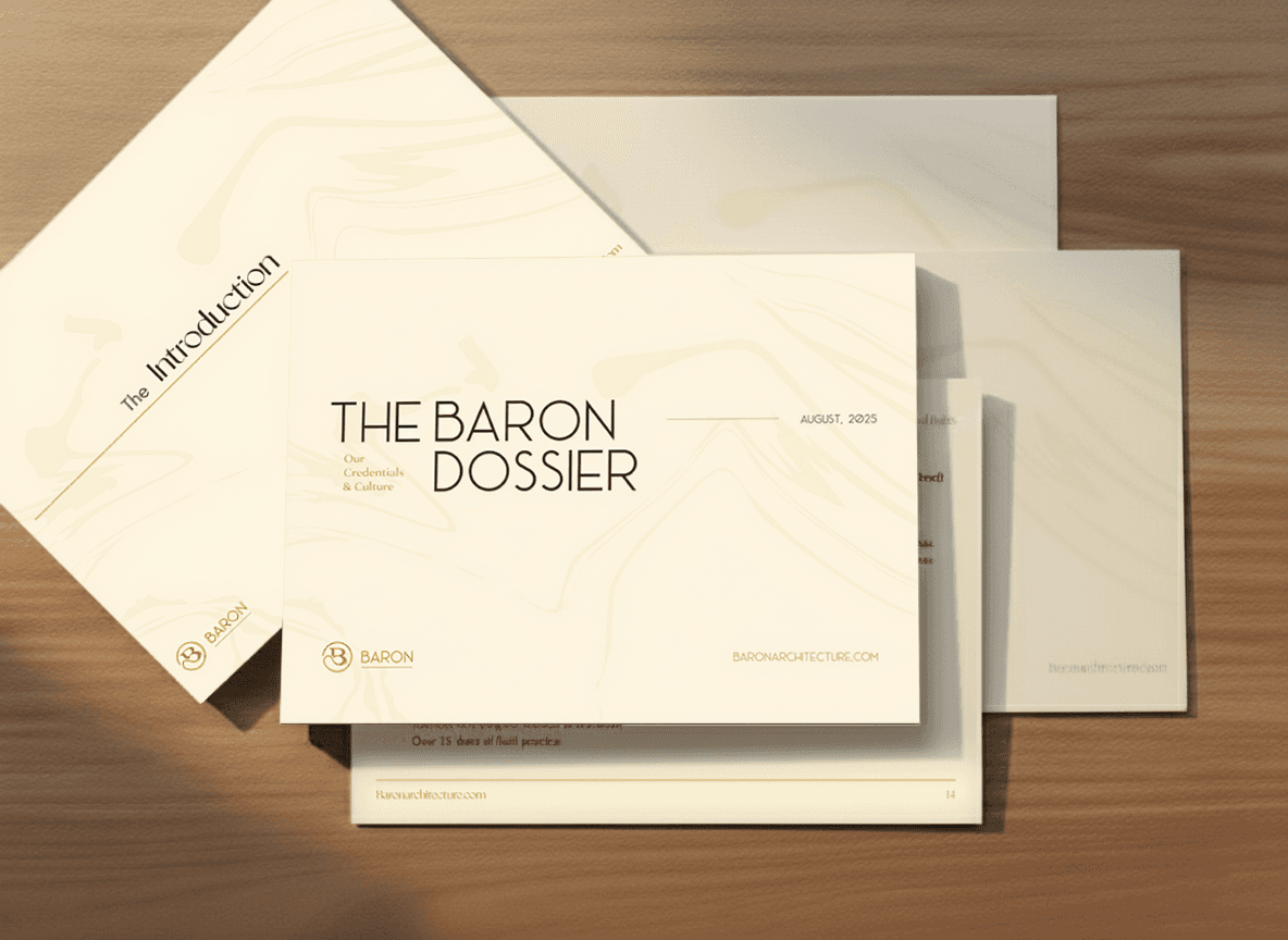
The print presentation below shows how the profile could be experienced as a physical object. It is an illustrative mockup of the design, while the architectural work and photographs remain part of Baron’s portfolio. The website and editorial materials are presented here as complementary expressions of the practice.
04 / Identity in use
A quieter signature, carried through.
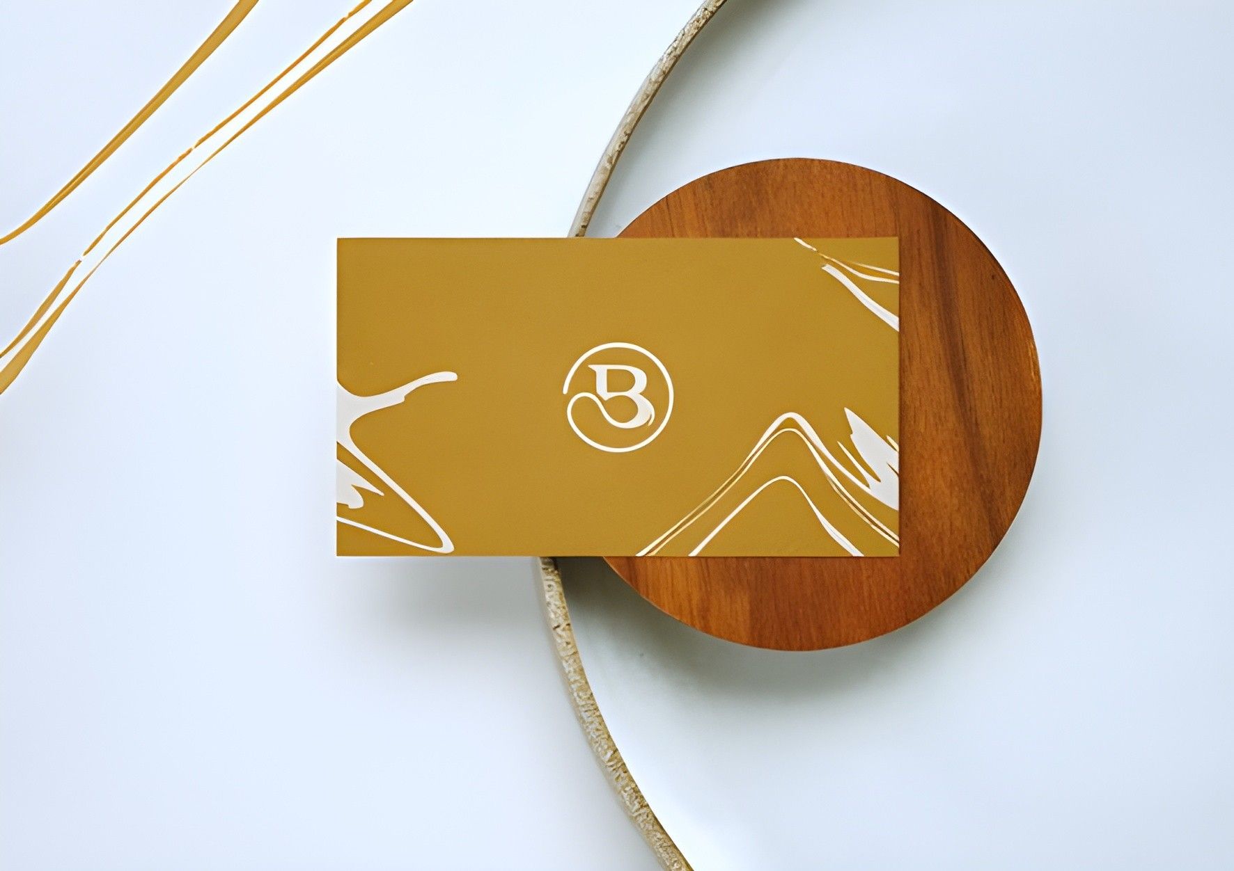
With Baron’s original logo as the starting point, the wider communication system uses a restrained palette and deliberate typography to connect digital, editorial and physical presentations. These folder and dossier mockups show the identity in context. They illustrate the proposed applications; they do not claim that XAI designed the architecture or the original logo.
Event Hive